Opia.com – Full Brand & Digital Refresh
“Opia creates innovative ways to drive your revenue, increase your margin, nurture brand preference and reward brand advocacy. Our high impact offers are a cost effective and risk free way to out manoeuvre your competition.”
BLC were proud to be invited into Opia’s world to allow us to help them define who they are in their space, what they had to say to their industry and how to build a brand around those core values that would attract followers and clients alike. Being bold innovators it became clear that Opia were ready to become thought leaders in the new space they had created within the sales promotion world.
Working with our network of brand consultants, copywriters and our in-house creatives we were able to collaborate with Opia to create a manifesto to inspire and galvanise their staff and a coherent honest and confident tone of voice throughout all of their communications from thought pieces right down to how to say hello and what to right on their mast head.
Working with our digital partners Kish and Chips we then took this new attitude, outlook and renewed energy and created an entirely new site built ground up to allow Opia to manage the backend CMS in-house. We created bespoke iconography, developed a full brand guideline to cover everything from image selection to align with the tone of voice, core values and two front-of-house animated films explaining Opia’s unique and innovative approach to new audiences.
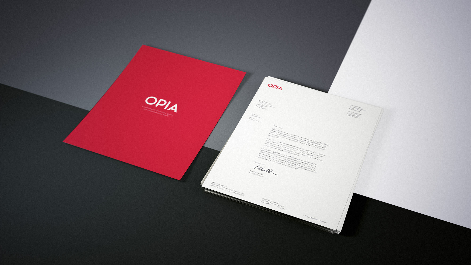
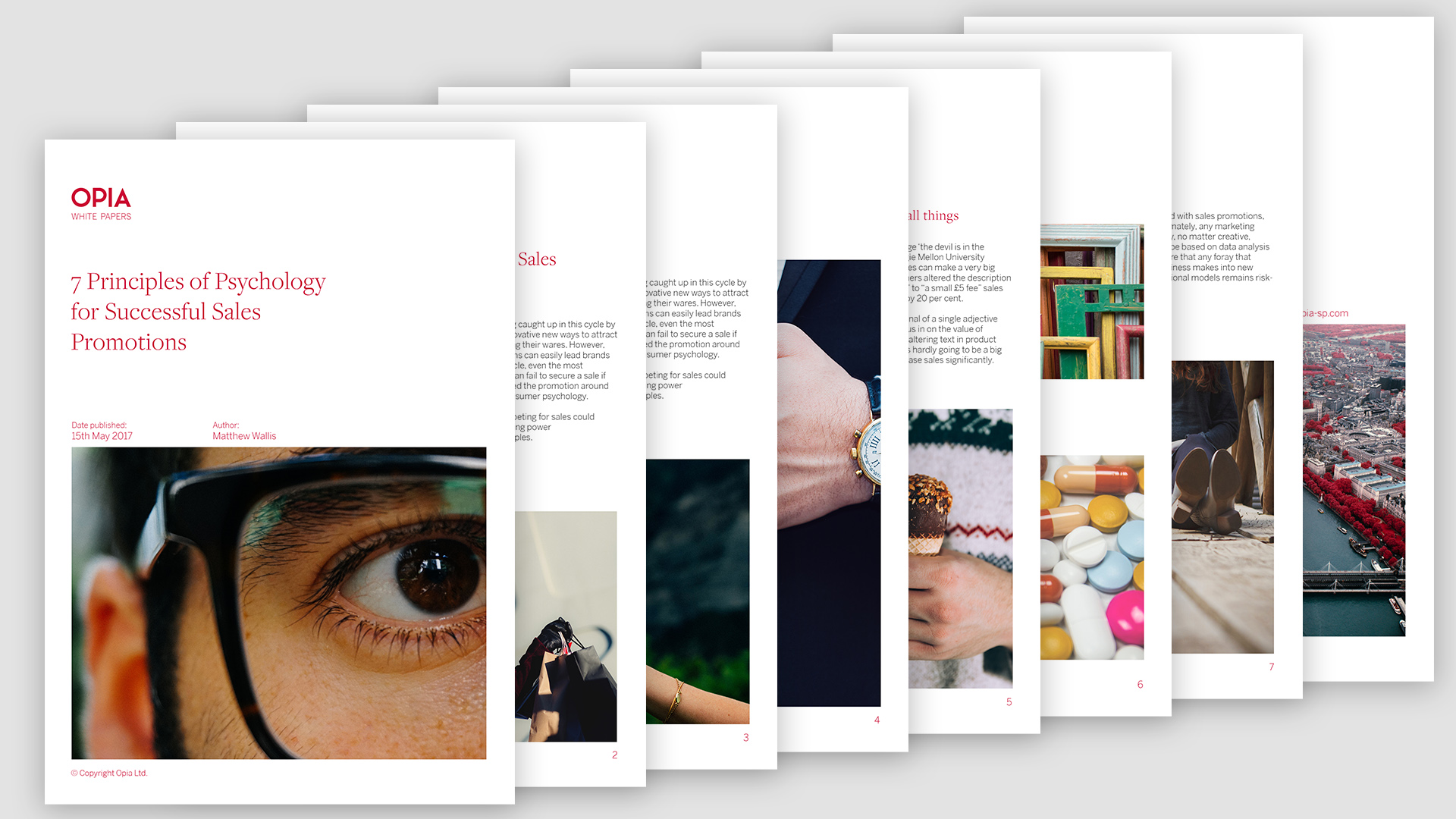
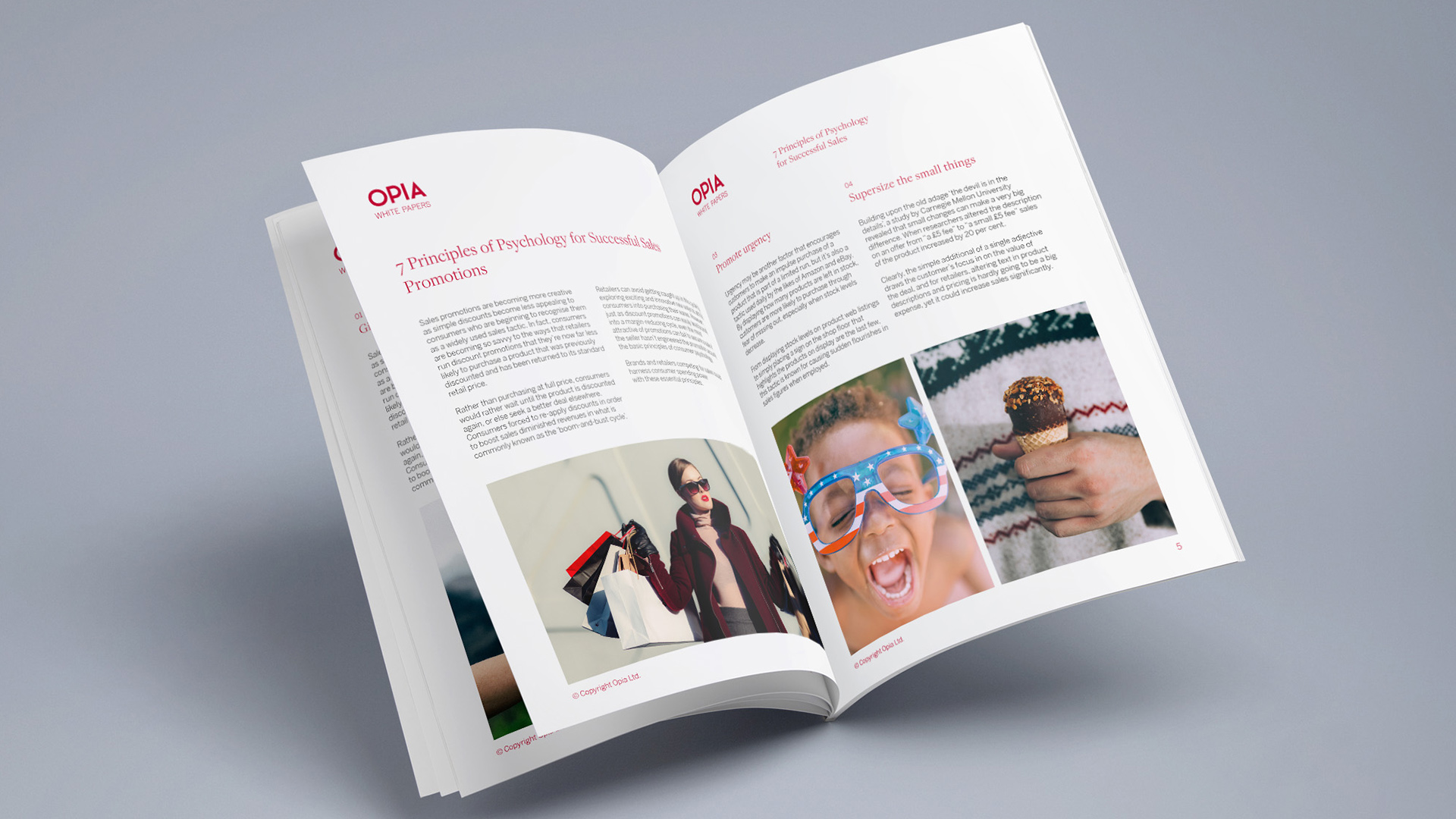
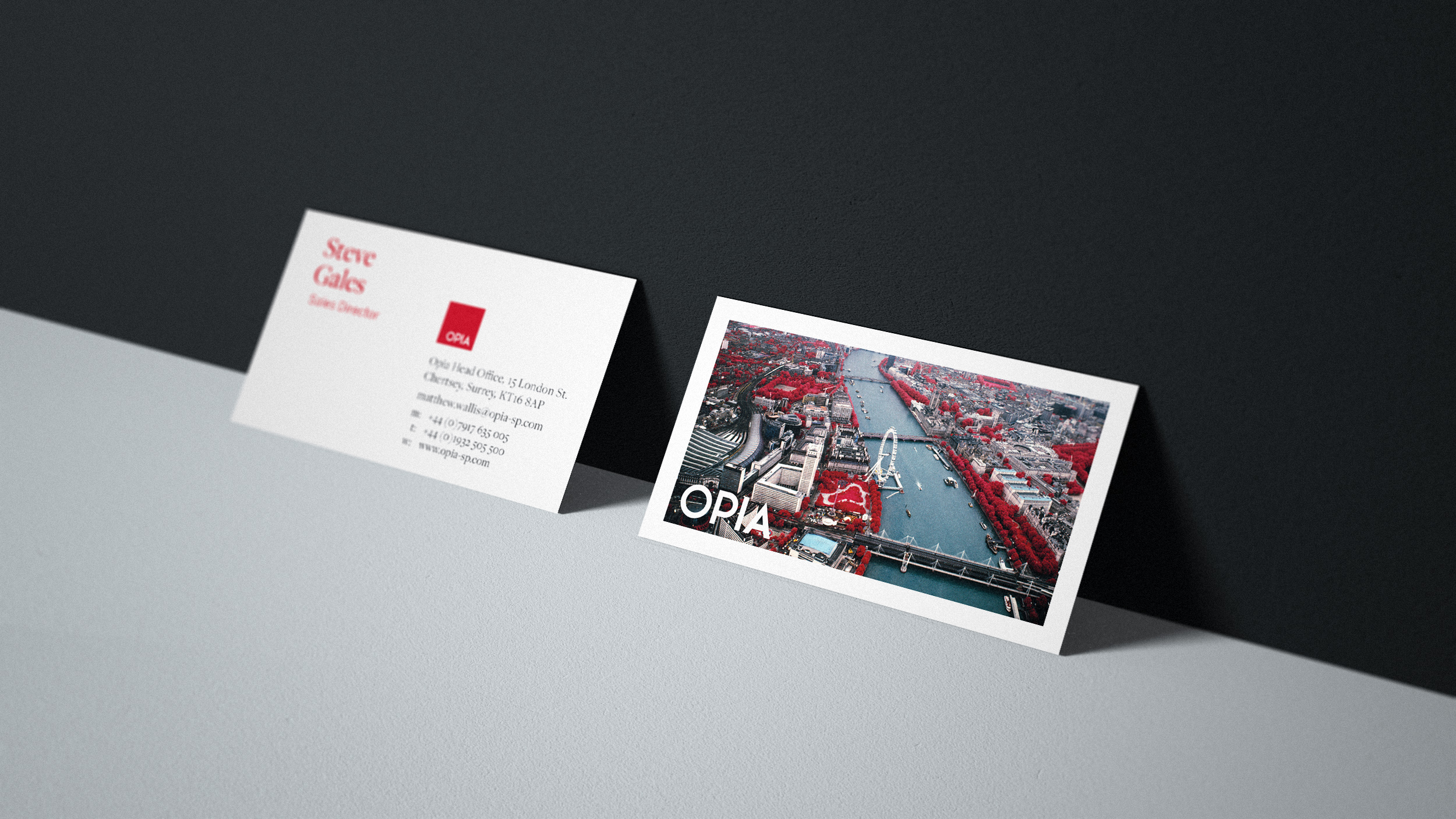
We completed an entire brand refresh starting with the logo and covering; front-end web design, stationery, white papers, social media mast-heads, emailers, footers, staff photography and everything in-between. This consistency of design has ensured Opia’s brand has a clear and resonant message across all touchpoints and a platform with which to get their message out there and continue to grow their following.
See the site live in the link above and the print and digital brand assets below on this page.
Opia.com ground up redesign
We created a strong ownable palette, clean and photography led style-sheet with a confident globalista feel to reflect the broad reach of the companies footprint. The photography was carefully selected to ensure a professional ‘high-end’ impression was felt throughout with lots of human connection and striking compositions. We developed an iconic style for the mast-head, about us, stationery and brochure photography using infra-red aerial photography of each global locale – which was a great way to connect the photography to the red brand colour but also create an atmosphere of doing things differently as is Opia’s M.O.
Opia.com walk-through
We created a tactile and always live feeling to the site with chat bot, rolling brand header statement with layered video and deep linking header scroller promoting thought pieces, key case-studies and educational content without the user having to navigate past the
landing area.
Opia. Inspire. Opia. Protect. Opia. Innovate. Opia. Challenge.
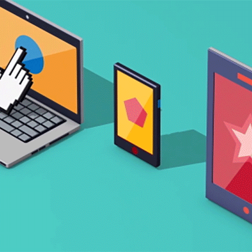
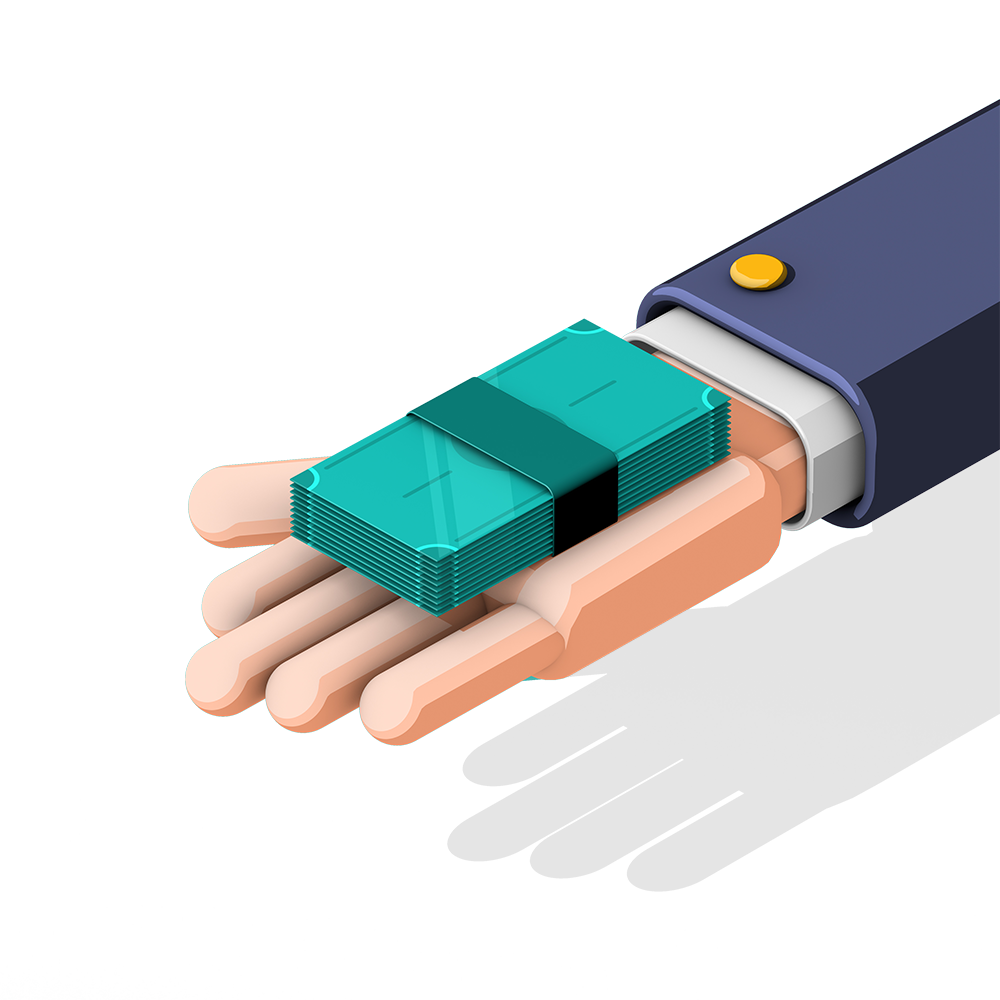
Explainer films and icons using a bespoke iconographic style
BLC created two films aimed to explain the unique and innovative sales promotion products that Opia offer. As this is their USP the films had to communicate very clearly the benefit of the services, the mechanics and the pay-off. We developed a 3D iconographic style that allowed us to reinforce the script with a creative approach that left nothing to interpretation whilst being engaging and fun to watch.